
From time to time I receive feedback from individuals regarding the layout of privacy browser on small screens. Usually this feedback relates to eliminating an element that they feel is not important enough to warrant the space utilization or diminishing the size of the fonts so that more information can fit on the screen. I am always thankful for these suggestions (I at least remind myself that I should always feel thankful for these suggestions), and sometimes they have led to beneficial changes in the layout. Other times there are reasons for the current design that the person making the suggestion has not considered. I thought it would be helpful to write a post explaining some of these design decisions so that they would be better understood by the community.
When designing Privacy Browser, there are a number of general principles I follow.
- Present as much control and feedback to the user as possible.
- Use the minimum possible amount of screen real estate.
- Minimize the number of taps that are required for common actions.
- Reuse existing Android elements as much as possible.
Let me explain of what I mean by each of these points.
Present as much control and feedback to the user as possible
There is both an art and a science to presenting lots of information to the user in a small amount of space in a way that is intuitive and useful. Many programs want to hide important information from users in a misguided attempt to make things “simpler”. Others organize information in a way that is jumbled or difficult to understand. The best programs present all the desired information in an intuitive format that isn’t distracting.
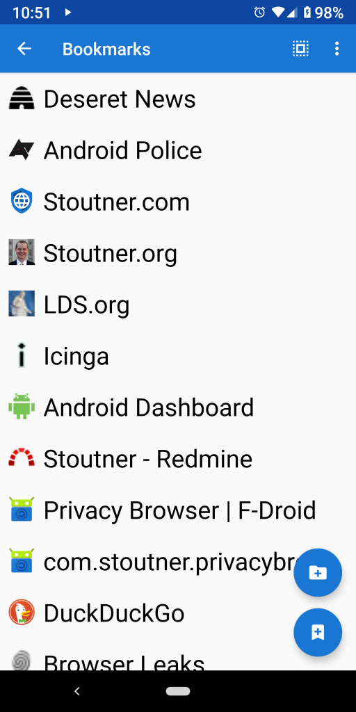
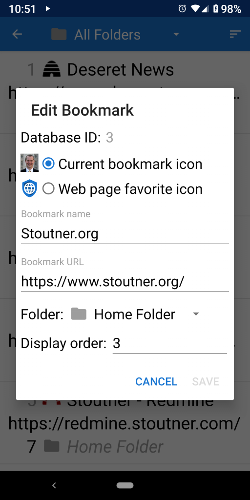
An example of how this design philosophy plays out in Privacy Browser can be seen in the bookmarks interfaces. Privacy Browser’s bookmarks are stored in a SQLite database. Most users don’t want to think about any of the complexities of the underlying structure of the data storage. They just want an easy and intuitive way to interact with their bookmarks. However, there are other scenarios, like troubleshooting database import/export problems, where a power user might need to access or modify the underlying data structure. This led me to create two interfaces, one for general bookmark usage, and one to view and edit the bookmark database values.
Use the minimum possible amount of screen real estate
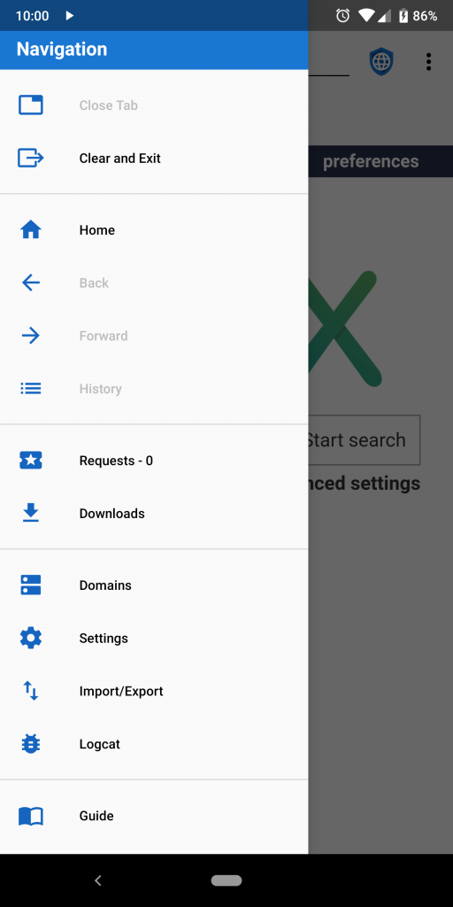
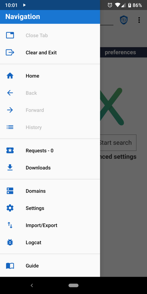
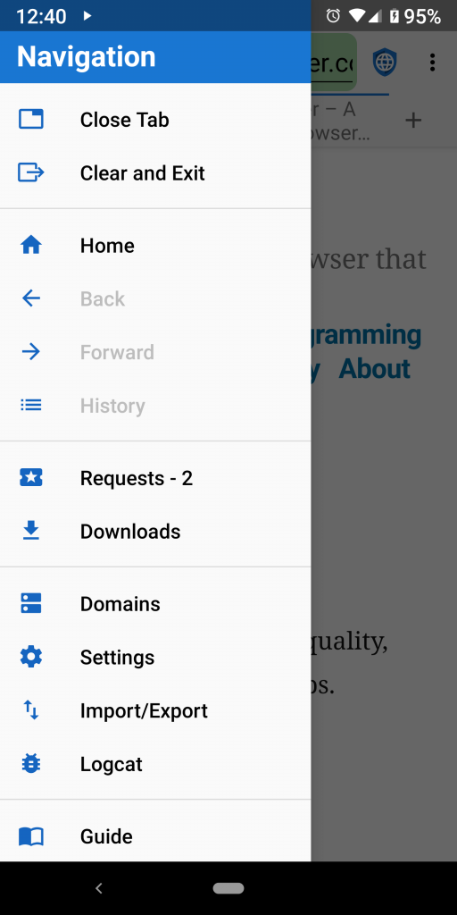
Nobody likes wasted space, especially on a small phone. Now, this might sound obvious, but to use real estate effectively, each item in the interface must be big enough to see or read, and nothing the user interacts with can be smaller than their finger. Privacy Browser’s two drawer layouts provide a good case study. The navigation menu that opens on the left is generated by a standard Android NavigationView, which provides developers little control over the layout. As you can see in the screenshots below, the interface has been designed to space each entry far enough apart that the user doesn’t accidentally tap the wrong item. Like many default Android interfaces, it uses a relatively small font with a large amount of white space between the lines. On the other hand, the bookmarks drawer that opens on the right is a custom interface that I built. Each entry is also spaced sufficiently so that accidental taps are avoided, but my personal preference is to use larger fonts and less white space. This often has the effect of making users feel that the space is being wasted (because the font is so large), leading them to believe that if the font were smaller more bookmarks could be displayed on the screen. However, the constraining limit on the bookmarks is less about the size of the font and more about the minimum size of the human finger. Consider the three examples below, which are screenshots taken on a Pixel 2 XL running Privacy Browser 3.0.1. With a small system font size, the number of entries in the navigation menu is 13 and the number of displayed bookmarks is 16. When the default system font size is used, the number of entries in the navigation menu remains 13 and the number of displayed bookmarks is slightly more than 14. When the largest system font size is used, the number of entries in the navigation menu is still 13 and the number of displayed bookmarks is 12.
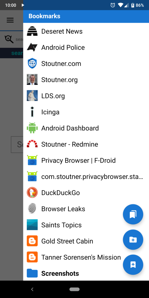
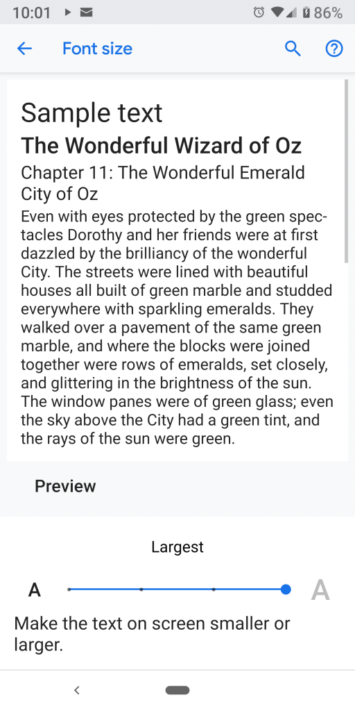
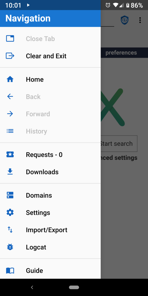
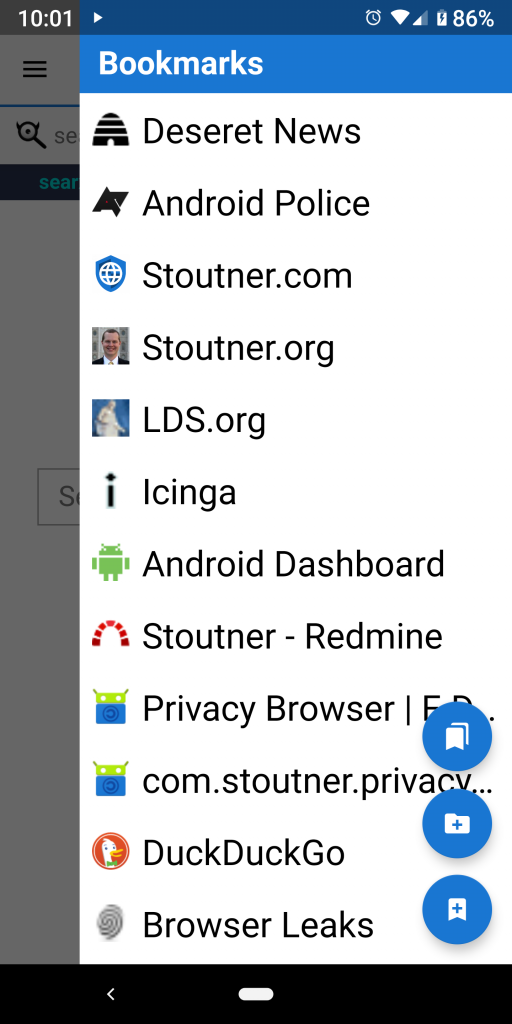
The takeaway from this is that, even thought the font size is larger in the elements I designed in Privacy Browser, the number of bookmarks displayed is greater than if I had followed the standard Android design guidelines used in the navigation menu. It functions as a sort of optical illusion. Even when placing the screenshots side by side, the mind still wants to think that more information is displayed in the navigation menu. But not only does my interface convey more entries for all layouts except for the largest system font size, it does so using nice, big fonts (something I really enjoy even though I have good eyes and something that people with poor eyesight find absolutely essential). It also provides more flexibility to the user by actually adapting the amount of information on the screen to the system font size that is selected, as compared to the standard Android layout, which adjusts the white space so that, on this particular device, 13 entries are all that are ever displayed.
Minimize the number of taps that are required for common actions
I don’t know any developer who doesn’t agree with this in principle, but it can be very hard in practice because 1) different users use different actions, and 2) every time you make something easy to get to you use up precious screen real estate. It is somewhat funny to me that almost every time I make any change to the layout of the options menu I receive feedback from users somewhat along the lines of, “How come you moved my favorite command to a submenu? I use it all the time and now it takes two taps! Also, why don’t you get rid of all the other commands. I never use them and they are just in the way.” As a developer, I can’t just consider how I use the app, but I have to try to think of all the possible ways users might use it.
Figuring out the optimal design ends up being quite a balancing act, one that gets refined over time based on my own personal experiences using Privacy Browser and the feedback I receive from users. As a case study, let me explain the process of designing the tab interface that was released in version 3.0. From the very beginning of the process I wanted to have a tab interface that was displayed directly on the main Privacy Browser window. Most other phone browsers hide their tab interfaces somewhere behind a button or a swipe, so that it takes two actions to do anything with tabs. For some browsers this also involves switching to a secondary activity that covers the entire screen. I knew it wouldn’t be possible to have everything relating to tabs visible on the screen at all times, but I wanted to get at least the most commonly used actions there.
The resulting design uses a TabLayout that is part of the app bar (under the action bar). It is designed so that on almost any device it is possible to see at least two tabs at once. It also has an easily accessible button for adding a new tab, which is a common action and doesn’t take up much additional screen real estate. Because Android already makes the tabs about as tall as a standard finger touch, it made a lot of sense to display the website title in two lines, thus displaying more information.
Initially I thought about adding a close button on each tab, similar to what Firefox or Chrome have on their tablet interfaces. However, I didn’t do this for two reasons. 1) I was concerned that users would accidentally close tabs when they meant to do other things. For example, if more than two tabs are opened on a small device, the user has to drag the tab layout left and right to scroll between them. It would be easy for the drag gesture to accidentally be detected as a tap on the close tab icon. And the absolutely worst kind of interface, worse than having a desired command buried beneath seven layers of submenus, is an interface that mistakes your intentions and does something different than what you just told it to do. 2) I don’t think Android’s TabLayout will allow users to interact with individual elements inside the tab. So the only way to accomplish this would probably be to either modify TabLayout or design an entirely custom interface from scratch. This would be an awful lot of work for something I expect wouldn’t work that well in the end, although there is an open feature request for this and I will probably look into it deeper in the future.
My solution was to place the close tab command as the first entry in the navigation menu, meaning that adding a tab takes one tap but closing a tab takes two (not a very symmetrical experience). Based on user feedback, in version 3.0.1 I added the ability to close a tab that is at the beginning of its WebView history using the back button. This allows tabs that are opened by an intent from another app to be quickly closed with one tap by hitting the system back button on the navigation bar. Not only is this a fairly intuitive interaction for most Android users, but it also takes care of closing tabs in 90% of my personal workflow. It is not a perfect solution, and things will likely evolve in the future, but it represents the current balancing act between usability, screen real estate, and what makes the most sense for the majority of users.
It was as I writing this post that I realized I could place the close button on the left of the TabLayout, similar to how the open button is on the right. This has the advantage of being far enough away from everything else so as not to be a casualty of accidental taps. It is easy to implement because it doesn’t require differentiating taps on different sections of a tab. And, when there is only one tab, it runs Clear and Exit, which is a feature I have always wanted to have on the app bar for one-tap access, but I was never previously able to justify the space.
As is usually the case, once you discover a good solution, it seems obvious. But it can often take a lot of work to figure it out.
Reuse existing Android elements as much as possible
Android has a bunch of standard views, widgets, commands, tools, and other elements that can be used to build apps. It is also possible to custom build almost anything with enough work. One of my design philosophies is to use the standard building blocks as much as possible. There are several benefits in doing so. Among them are that Google spends a lot of time making sure these elements scale well between different screen sizes. They work across all the various versions of Android. They are automatically updated when newer versions of Android come out. They scale to different form factors (like tablets) and even to different environments (like Chromebooks). Custom code, on the other hand, requires much more extensive testing to make sure it is going to work across all the various devices out there in the real world. It can require extensive refactoring when new versions of Android come out. It might not adapt to new environments, like Chromebooks. And it won’t automatically update to follow newer theme guidelines, creating a less consistent user experience between Privacy Browser and other Android apps, which increases the learning curve and UX (User eXperience) dissonance.
All that being said, using the standard Android tools is also problematic. Android is buggy, Google isn’t very receptive to bug reports (they barely even read them), and really nasty glitches can continue for years without resolution or even acknowledgment. Also, these tools often don’t do exactly what you want them to do, leading to a lot of compromises and imperfect solutions. And they tend to waste a lot of screen real estate. Although many examples could be given, two will suffice, one where I have chosen to use the default tool even though it is imperfect and the other where I have built a custom solution.
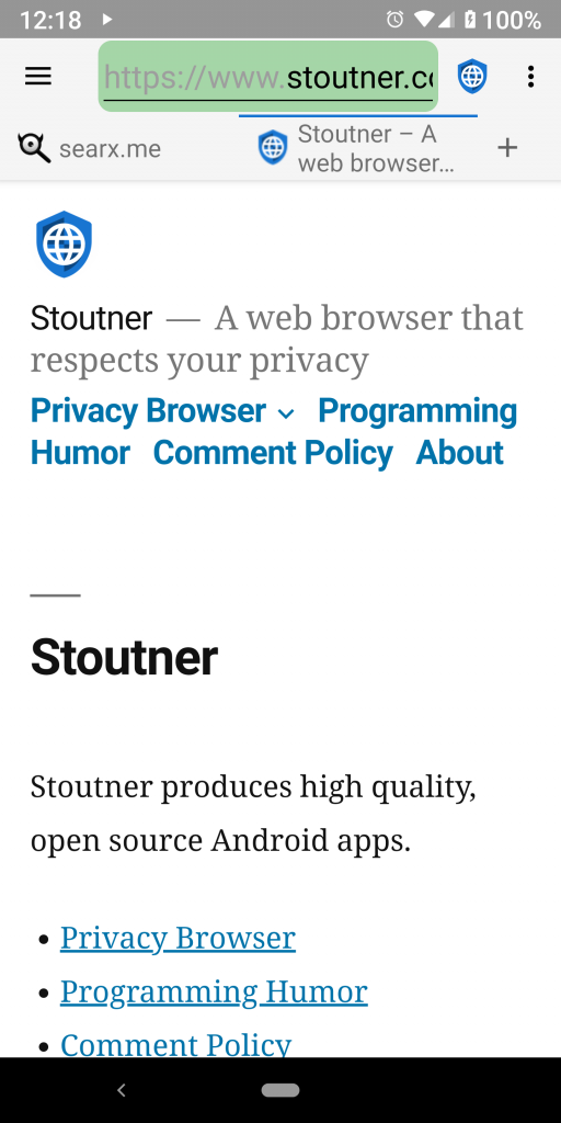
Android has a standard icon for opening the navigation drawer, called the hamburger icon because of the three horizontal lines that look (only a very little bit) like a hamburger bun with a meat patty in the middle. There is a standard tool, ActionBarDrawerToggle, that lays this out in the top left of the action bar and makes it interface with the navigation drawer. The selection, animation, and layout of the icon are all handled by ActionBarDrawerToggle. However, the layout it uses consumes too much white space, as can be seen by the huge wasted area between the hamburger icon and the beginning of the URL text box in the screenshot below. I have considered replacing it with a custom layout, and I might well do so at some point in the future. But the advantage of using a standard tool has so far outweighed the negative of the lost space.
The other example has to do with nested scrolling of the WebView, which allows the app bar to be scrolled off the screen. As described earlier, adding the tabbed interface requires a significant amount of screen real estate. This isn’t really viable unless there is a way to recapture that space while reading a website. Android has an entire set of tools for doing this, but for reasons that make no sense, they do not support doing so with WebViews. So, before I even started working on tabbed browsing, in the last major release of the 2.x series, I implemented an extension of Android’s WebView that worked with nested scrolling of the app bar. It wasn’t easy, but the functionality is so central to what Privacy Browser is trying to accomplish that it was necessary to do so.